Crystal Sun
Data Visualization Eng. & Scientist
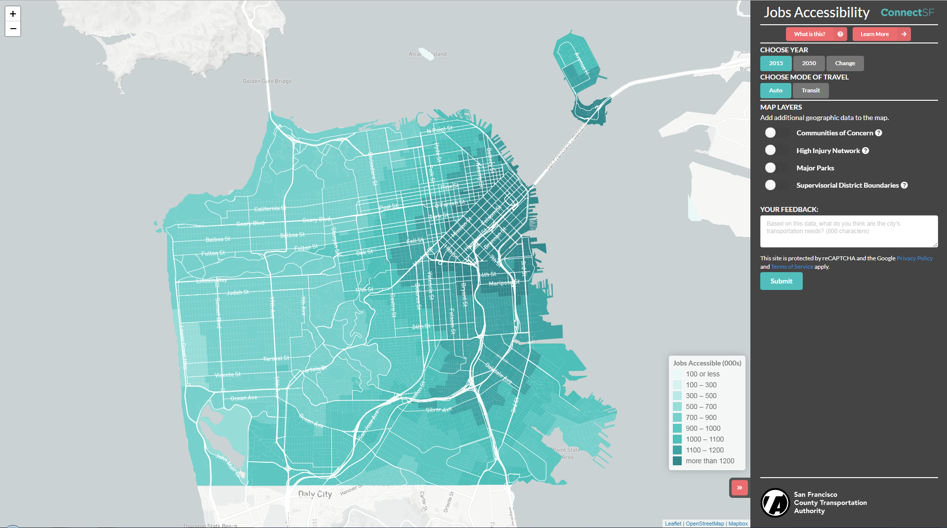
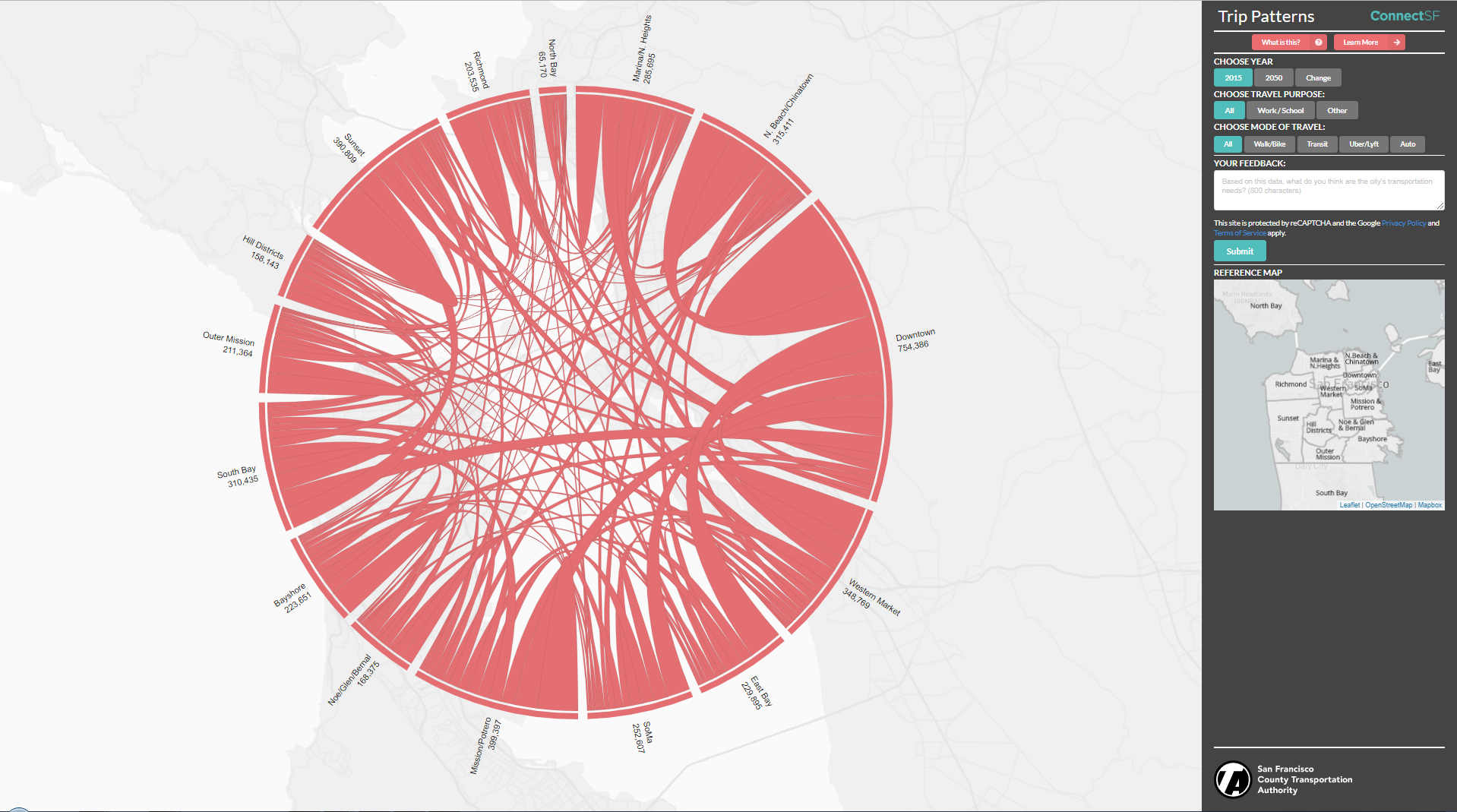
ConnectSF Visualization
ConnectSF define a 50-year vision of San Francisco's future that represents our priorities, goals, and aspirations as a city within the larger Bay Area. In this project, I developed:
- Map for showing the average number of jobs that a person can access in a 45-minutes transit trip and a 30-minutes driving in San Francisco [Preview]
- Chord map to showing the trips pattern within San Francisco Area [Preview]
These visualizations will give the pulic and transportation system people full view of the city changing, opportunitis to interactive with and dig into with data. Also they will guide plans for the City and its transportation system toward one collective goal.
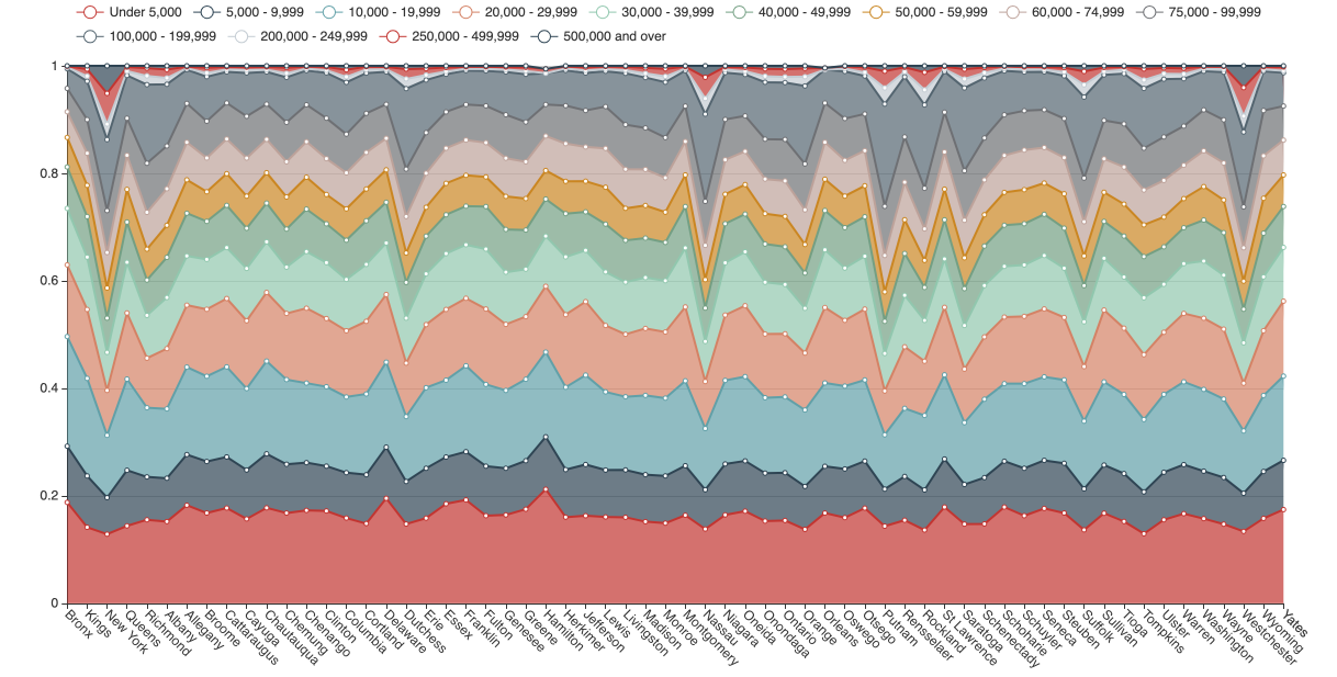
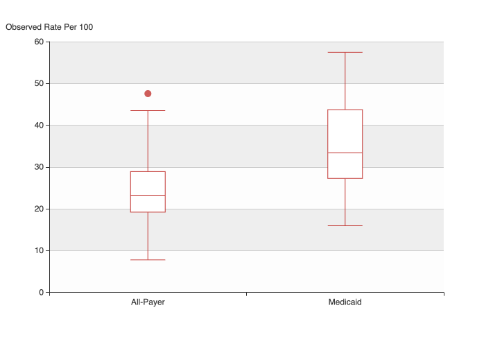
Echarts Showcases
Echarts is a JavaScript library for building web-based visualization. I used it for some interactive, dynamic data visualization projects:
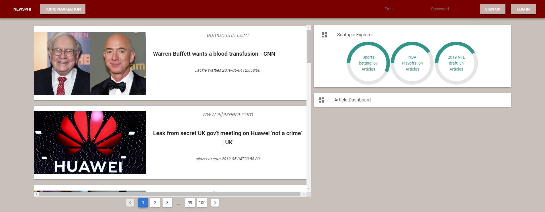
NewsPhi
An aide for contextual news consumption. We developed a newsfeed website, which combine traditional newsfeed together with our dashboard with critical analysis tools.
In this project, I am responsible for implementing data pipeline, back-end database setting up, and developing front-end website. We implement a automic data pipeline from our streaming data source to Amazon S3, to critical analysis models, and output to Amazon RDS for PostgreSQL, and then PostgREST api to connect RDS with front-end website. For the website development, we choose to use Vue.js for website interactive parts, and flask for user log in and behavior tracking system.
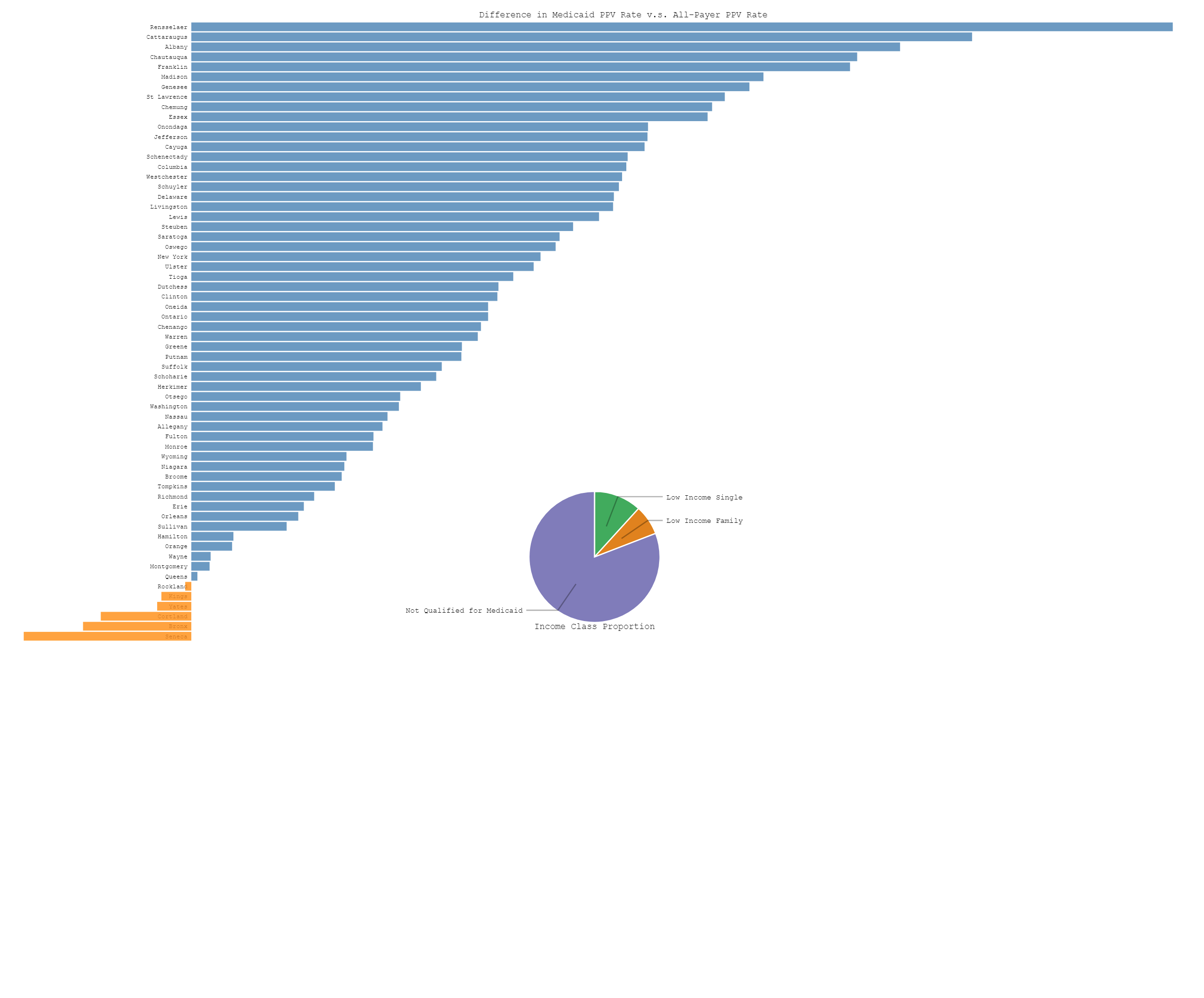
D3 Showcases
D3.js is a JavaScript library for manipulating documents based on data. D3 helps you bring data to life using HTML, SVG, and CSS. D3’s emphasis on web standards gives you the full capabilities of modern browsers without tying yourself to a proprietary framework, combining powerful visualization components and a data-driven approach to DOM manipulation. I used it for some interactive data visualization projects: